

Images account for 45% to 65% of a median web page’s total byte size, yet selecting the wrong asset type can quietly destroy your site speed. Mastering how to choose the right file format for images is one of the fastest ways to eliminate sluggish browsing and fix blurry exports. If you’ve ever watched a clean graphic turn pixelated on high-resolution displays or noticed heavy files dragging down your Core Web Vitals, you know how tricky export settings can feel.
Balancing visual fidelity with fast load times doesn’t require memorizing dense compression algorithms. You’ll discover a straightforward framework to match vectors with geometric artwork and modern codecs with rich photography. We break down when to use high-efficiency formats like AVIF and WebP versus reliable staples like SVG, PNG, and JPEG, helping you deliver sharp assets that look flawless on retina screens and physical print.
Key Takeaways
- Separate pixel-based raster assets from scalable vector artwork to keep icons and logos razor-sharp across all display densities.
- Learn how to choose the right file format for images using a practical five-step framework based on your visual content type.
- Adopt modern web codecs like AVIF and WebP to drastically lower page weight while preserving rich photographic detail.
- Implement responsive HTML picture elements with legacy fallbacks to ensure fast performance and universal browser compatibility.
- Balance compression quality and export resolution to produce clean visuals for both mobile screens and commercial print projects.
Understanding Image Fundamentals: Raster vs Vector and Compression Basics
Digital image files are standardized containers that package visual information so browsers, operating systems, and printers can display graphics accurately. Learning how to choose the right file format for images begins with understanding whether your asset relies on a fixed grid of color values or dynamic mathematical coordinates. Selecting the wrong container creates heavy pages that consume unnecessary hosting bandwidth, or leaves crisp artwork looking soft and pixelated.
Reviewing image file format fundamentals helps creators make practical decisions instead of relying on default export settings. Every graphic format makes specific trade-offs between storage weight, rendering speed, and visual fidelity.
Raster vs Vector Graphics Explained
Raster images map visual data across a fixed grid of colored squares called pixels. Formats like JPEG, PNG, and WebP rely on this structure, making them well suited for photographic content with complex color blends. Because rasters depend on fixed dimensions, enlarging them stretches existing pixels and introduces noticeable blurring along sharp boundaries.
Vector graphics use mathematical equations to plot shapes, lines, polygons, and fills. Instead of storing hardcoded pixels, vector containers store instructions that recalculate based on the viewing screen. This allows vector illustrations and typography to scale indefinitely without losing sharpness, making them the standard choice for responsive website logos and interface icons.
Lossy vs Lossless Compression Differences
Compression engines reduce file weight to conserve storage and speed up network transfers, but they handle image data in two distinct ways:
- Lossy compression: Discards fine, redundant tonal gradients that human vision struggles to detect. This approach achieves substantial reductions in file size, but re-saving lossy files repeatedly compounds visual compression artifacts.
- Lossless compression: Shrinks file size by reorganizing data efficiently without removing original pixel values. The decoded image matches the raw source bit for bit, ensuring sharp edges around text and graphic overlays.
Determining how to choose the right file format for images ultimately comes down to whether your project requires maximum data savings for mobile users or pixel-perfect clarity for detailed technical graphics.
The Essential Image Formats: From Legacy Standards to Modern Codecs
Every digital creator regularly handles a small group of core image formats. While legacy files still dominate older systems, modern compression standards have transformed web delivery. Knowing how to choose the right file format for images requires balancing broad software support against the bandwidth savings delivered by newer algorithms.
According to W3Techs data from September 2026, PNG appears on 75.4% of websites and JPEG on 69.4%, yet adoption of modern image formats continues to climb. WebP sits at 21.9% penetration, while AVIF has reached 1.7%. Understanding what each extension accomplishes helps you pick the right tool for every screen.
JPEG and PNG: The Established Workhorses
JPEG remains the universal standard for continuous-tone photography across virtually every operating system, camera, and desktop software tool. It provides dependable lossy compression, though it replaces transparent backgrounds with solid white pixels. Saving photographic assets as PNG files is a common mistake; because PNG relies on lossless compression, saving complex photos as PNGs generates file weights three to five times larger than an equivalent JPEG.
PNG excels at clean line art, user interface graphics, and typography. Its support for 24-bit color depth and full alpha transparency ensures transparent logo backgrounds blend seamlessly over colored web elements without jagged halos.
WebP and AVIF: The Next-Generation Web Champions
WebP serves as the modern safe default for web publishing. It boasts over 98% browser compatibility while supporting lossy encoding, lossless compression, and alpha transparency in a single container. AVIF, derived from the AV1 video codec, pushes compression even further by producing files 20% to 30% smaller than WebP and 45% to 55% smaller than JPEG at comparable visual quality.
AVIF offers between 93% and 96% global browser support, though high-resolution encoding takes longer during site build processes. Using automated export workflows lets you serve AVIF first with a WebP fallback for older clients. If you need help selecting tools to automate these conversions, explore our hands-on guides at suggestmetech.com for practical workflow recommendations.
SVG and Specialized Formats: Vector Scalability and Print
Specialized tasks require dedicated tools rather than general-purpose photo formats:
- SVG (Scalable Vector Graphics): Uses XML code to render logos and interface icons. It scales smoothly across retina displays while maintaining tiny byte sizes.
- TIFF: Preserves uncompressed raster data and CMYK color profiles, serving as the trusted industry benchmark for commercial print production and raw photo archiving.
- GIF: Retains widespread support for simple looping animations, though its rigid 256-color ceiling makes it obsolete for static images compared to WebP or animated AVIF files.
Deciding how to choose the right file format for images ultimately means avoiding one-size-fits-all exports and pairing the right file extension with your target medium.
Comparing Image Formats Across Performance, Quality, and Compatibility
Selecting an image format requires evaluating trade-offs between compression efficiency, decoding demands, and client compatibility. While web delivery prioritizes minimal byte size to preserve bandwidth, physical print and digital archiving demand uncompressed color depth. Knowing how to choose the right file format for images means balancing these delivery constraints against visual requirements.
The following breakdown highlights how core formats perform in practical production workflows, comparing browser coverage, transparency fidelity, and optimal use cases.
Compression Efficiency and Page Load Impact
Because visual media comprises 45% to 65% of a median website’s transfer weight, image efficiency dictates user experience. Hero images and featured banners frequently serve as the Largest Contentful Paint (LCP) element in Google Core Web Vitals audits. Delivering an oversized PNG instead of a compressed AVIF or WebP file delays visual rendering, directly hurting search rankings.
Publishers planning how to start a blog in 2026 must optimize media early. Running lean image payloads keeps hosting transfer costs low and speeds up mobile page delivery over slower cellular networks.
Browser Support and Software Compatibility Matrix
Modern codecs offer superior compression, but older desktop applications, email clients, and commercial print shops still rely on traditional containers. Evaluating format attributes side by side makes it easy to choose the right asset for your production pipeline:
| Format | Compression | Browser Support | Transparency | Best Used For |
|---|---|---|---|---|
| AVIF | Lossy & Lossless | 93% – 96% | Full Alpha | High-performance web imagery and LCP elements |
| WebP | Lossy & Lossless | Over 98% | Full Alpha | Universal modern web default across all browsers |
| JPEG | Lossy | Universal (100%) | None | Legacy fallback, digital cameras, and general sharing |
| PNG | Lossless | Universal (100%) | Full Alpha | Screenshots, detailed UI graphics, and print proofs |
| SVG | Lossless (Vector) | Universal (100%) | Supported | Brand logos, interface icons, and responsive charts |
| TIFF | Uncompressed/Lossless | None (Native) | Supported | Commercial offset printing and master photo archiving |
Transparency, Color Depth, and Alpha Channel Capabilities
Transparency rendering varies widely across file types. GIF uses binary 1-bit transparency, meaning a pixel is either completely opaque or fully transparent. This creates jagged, pixelated halos when rounded logos sit on non-white backdrops. PNG, WebP, and AVIF utilize 8-bit alpha channels, creating 256 levels of opacity that blend smooth, semi-transparent shadows cleanly into any background.
For high-fidelity photography, color depth matters just as much. While standard JPEG and PNG files cap rendering at standard 8-bit color (16.7 million colors), AVIF supports 10-bit and 12-bit color depths. This extended range displays wide color gamuts and High Dynamic Range (HDR) content without gradient banding, helping creators showcase rich photography on modern OLED and HDR displays.
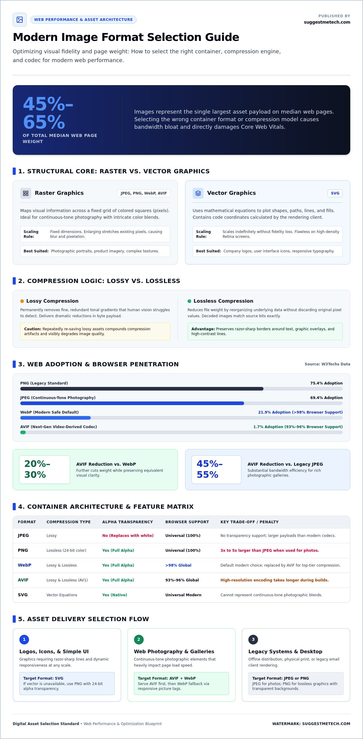
How to Choose the Right File Format for Images: A 5-Step Selection Framework
To choose the right file format for images, identify the content type, check transparency requirements, and select the optimal codec for your delivery channel. Export geometric art and interface icons as SVG, continuous-tone web photos as WebP or AVIF, complex graphics needing transparency as PNG, and physical print masters as uncompressed TIFF.
Instead of guessing inside export dialogs, applying a repeatable five-step evaluation process prevents common delivery mistakes. Walking through these criteria ensures your media loads instantly on mobile networks while maintaining sharp visual quality across high-density screens.
Step 1: Identify Image Content Type and Destination Channel
Start by auditing the visual composition of your raw asset. Is it a continuous-tone photograph with rich gradients, or a structured graphic built from solid geometric strokes? If your file consists of flat branding marks, user interface buttons, or sharp typography, export it immediately as SVG. Scalable vectors eliminate scaling issues on retina displays and keep network payloads tiny.
Next, confirm your target medium. Web browsers require maximum byte compression to pass Core Web Vitals audits, whereas commercial offset printing requires uncompressed color fidelity that web-first codecs cannot deliver.
Steps 2 & 3: Check Transparency Needs and Evaluate Modern Alternatives
Evaluate whether your layout requires an alpha channel to let background colors or textures show through:
- Web photography with solid backgrounds: Default to AVIF or WebP. These codecs compress complex photographic gradients efficiently without introducing noticeable blocking.
- Web graphics requiring transparency: Choose WebP with alpha transparency for general web assets. If your project includes intricate software screenshots or detailed infographics with embedded text, use PNG-24 to keep pixel edges razor-sharp.
- Commercial print workflows: Avoid web-focused compression entirely. Opt for uncompressed TIFF to preserve raw CMYK color separations and high pixel densities for printing presses.
If you want straightforward walkthroughs for configuring your site architecture and asset workflows, explore SuggestMeTech for practical site-building guides that simplify daily publishing tasks.
Steps 4 & 5: Set Size Budgets and Inspect for Visual Artifacts
Establish strict performance limits before publishing assets live. For standard desktop displays, aim to keep full-width hero graphics below 150 to 200 kilobytes, and limit inline editorial images to under 70 kilobytes. Adjust your export quality sliders to locate the threshold where file weight drops sharply without ruining image clarity.
Finally, inspect output files at 100% zoom. Check high-contrast borders for compression artifacts, color banding across sky gradients, and edge ringing around fine text. Once an asset looks crisp under native viewing sizes while staying within your byte budget, it is ready for deployment.
Optimization Best Practices: Preparing and Serving Images for the Web
Modern web optimization requires an effective serving strategy alongside proper codec selection. Simply converting files into lightweight extensions is not enough if your server delivers desktop-sized assets to handheld smartphones. Understanding how to choose the right file format for images works hand in hand with responsive delivery techniques and automated asset processing.
According to a June 2026 study on web image optimization, 68% of popular websites shipped at least one image four times larger in area than its rendered size on screen. Combining modern formats with structured responsive delivery eliminates this wasted bandwidth while keeping visuals crisp.
Serving Modern Formats with Graceful HTML Fallbacks
Modern web standards eliminate the risk of serving newer extensions to older browsers. Using the HTML5 <picture> element, you can serve next-generation formats while maintaining universal backward compatibility:
- Layered sources: Declare AVIF as the primary source, offer WebP as the secondary fallback, and place a standard JPEG or PNG inside the fallback
<img>tag. - Responsive sizing: Combine picture elements with
srcsetandsizesattributes to send smaller pixel dimensions to mobile viewports. - Host efficiency: Serving responsive images drastically cuts network payloads, lowering bandwidth consumption on the best web hosting services available.
Automating Image Compression and Stripping Metadata
Digital cameras and graphics software embed extensive metadata into exported files, including camera settings, EXIF details, and color profiles. Stripping this non-visual data before publishing clears up to 15% of a file’s initial weight without touching pixel quality.
Edge content delivery networks (CDNs) and content management system plugins can automate this entire workflow. Edge transformations convert raw uploads into AVIF or WebP on the fly, resize dimensions to match the visitor’s screen, and purge unnecessary headers instantly.
Digital Asset Management: Preserving Master Source Files
Never rely on compressed, lossy web assets as your permanent visual archive. Saving over an original file with a lossy WebP or JPEG permanently discards color data, making future edits or print reproductions impossible.
Always preserve your raw photos, layered PSD documents, and master vector SVGs on secure local storage or encrypted cloud backups. Content creators handling intensive graphic libraries benefit from workstations equipped with the best laptops of 2026, ensuring batch conversions and heavy visual exports run smoothly without system bottlenecks.
Applying this complete pipeline ensures that once you know how to choose the right file format for images, your digital assets remain fast, flexible, and future-proof.
Putting Your Image Optimization Strategy into Practice
Mastering how to choose the right file format for images transforms both your site performance and visual branding. Aligning visual structure with the proper file type, whether relying on scalable SVGs for UI marks or modern AVIF and WebP containers for dynamic photography, ensures your assets load instantly without sacrificing sharpness on high-density displays.
Combining smart format selection with responsive fallback tags protects your visitor experience across every browser. Backing up original uncompressed masters keeps your media library adaptable as digital publishing tools continue to advance.
Building a fast, responsive web presence becomes simple when you have tested recommendations at your fingertips. To level up your publishing toolkit, explore our expert technology reviews and practical guides. We deliver independent testing of web tools and productivity hardware alongside actionable advice, helping you make smart technical decisions with complete confidence.
Frequently Asked Questions
What is the best image format for website performance?
AVIF delivers the best overall website performance for photographic images, closely followed by WebP as a universal baseline. AVIF cuts file weights dramatically compared to older formats, which accelerates loading speeds across mobile connections. For geometric graphics, icons, and logos, SVG provides superior performance because its mathematical coordinate structure renders infinitely at fractions of a kilobyte. Combining SVG vectors with modern AVIF and WebP rasters yields the fastest site speeds.
Should I use WebP or PNG for transparent web graphics?
You should use WebP for transparent website graphics in almost all cases. WebP supports full 8-bit alpha transparency with file weights roughly 25% to 35% smaller than comparable PNG assets. This weight reduction speeds up page rendering while maintaining clean, anti-aliased transparency contours over colored surfaces. PNG remains preferable only when displaying detailed software interface screenshots or intricate technical diagrams containing fine line art that require bit-for-bit mathematical fidelity.
Is AVIF really better than WebP for online photography?
Yes, AVIF outperforms WebP for online photography by compressing photographic textures and gradients roughly 20% to 30% more efficiently at comparable visual quality. AVIF also supports 10-bit and 12-bit color gamuts, which virtually eliminates unsightly gradient banding across sunsets or skies. The primary limitation involves encoding speed during large batch exports. For critical hero banners, serving AVIF with a WebP fallback delivers the ultimate balance of visual quality and rapid mobile rendering.
Can SVG replace PNG completely for web graphics and logos?
SVG can replace PNG for vector-based graphics such as brand marks, interface buttons, line illustrations, and typographic elements, but it cannot replace PNG for complex raster graphics. When deciding how to choose the right file format for images, remember that SVG files contain mathematical instructions rather than fixed pixels. Attempting to convert intricate raster photos or high-density screenshots into SVG results in bloated code that crashes mobile browser rendering engines.
What happens to image quality when converting JPEG to WebP?
Converting a JPEG to lossy WebP can slightly reduce visual quality if the export quality slider drops below 80, because you are recompressing an already compressed file. This process introduces subtle generational loss. To achieve pristine results, always convert your WebP images directly from the uncompressed raw capture or original master file. When sourced from master files, WebP maintains crisp detail and color fidelity while stripping significant file weight compared to older JPEGs.
When should I still choose TIFF instead of JPEG or PNG?
You should choose TIFF when preparing assets for commercial print publishing, fine art reproduction, or master archival storage. Unlike web-centric formats, TIFF supports uncompressed 16-bit color channels and CMYK print color profiles required by industrial printing presses. Web browsers cannot natively display TIFF containers, making them completely unsuitable for online delivery. Keep TIFF as your permanent offline editing archive, then export lightweight web versions when publishing digital pages.
How do image file formats impact Core Web Vitals and SEO rankings?
Image formats directly affect Google’s Largest Contentful Paint (LCP) metric, which tracks how quickly a page’s primary visual element renders on screen. Knowing how to choose the right file format for images prevents bulky hero graphics from delaying this critical timing window. Fast-loading pages achieve better user engagement, lower bounce rates, and stronger organic rankings. Swapping heavy legacy formats for optimized AVIF or WebP containers consistently lifts performance scores across mobile audits.